

Brand Identity System for Listen Labs
Listen Labs is a coaching and consulting practice for UX researchers and research leaders. The brand needed to reflect its founder's philosophy: that listening is not a soft skill; it is the sharpest tool in the room. Warm but credible. Human but precise. The kind of identity that signals depth before a word is read.
Challenge
UX researchers are often the most perceptive people in the room, yet the least visible. Listen Labs needed a brand that elevated their expertise without overshadowing the founder's credibility. It had to resonate with two distinct audiences: senior leaders at large tech companies and individual practitioners navigating the next step in their careers.
Approach
This project went beyond visual identity. We discovered the client's strengths and built a brand that reflects who they are. We developed the identity, refined their communications, and clarified their value proposition, giving Listen Labs the confidence to step into the world with a brand that felt authentically theirs.

Brand Identity
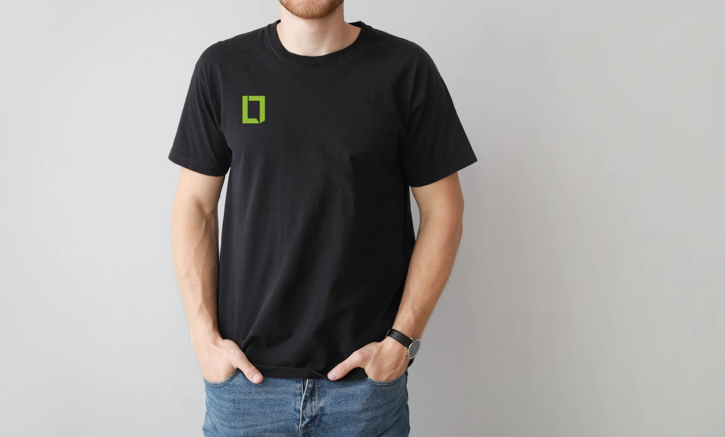
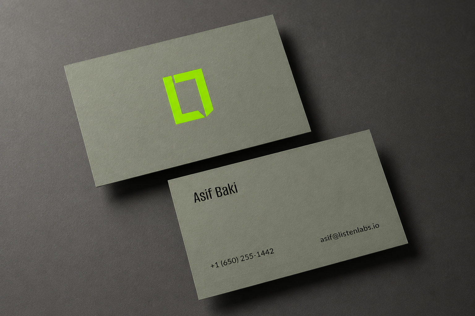
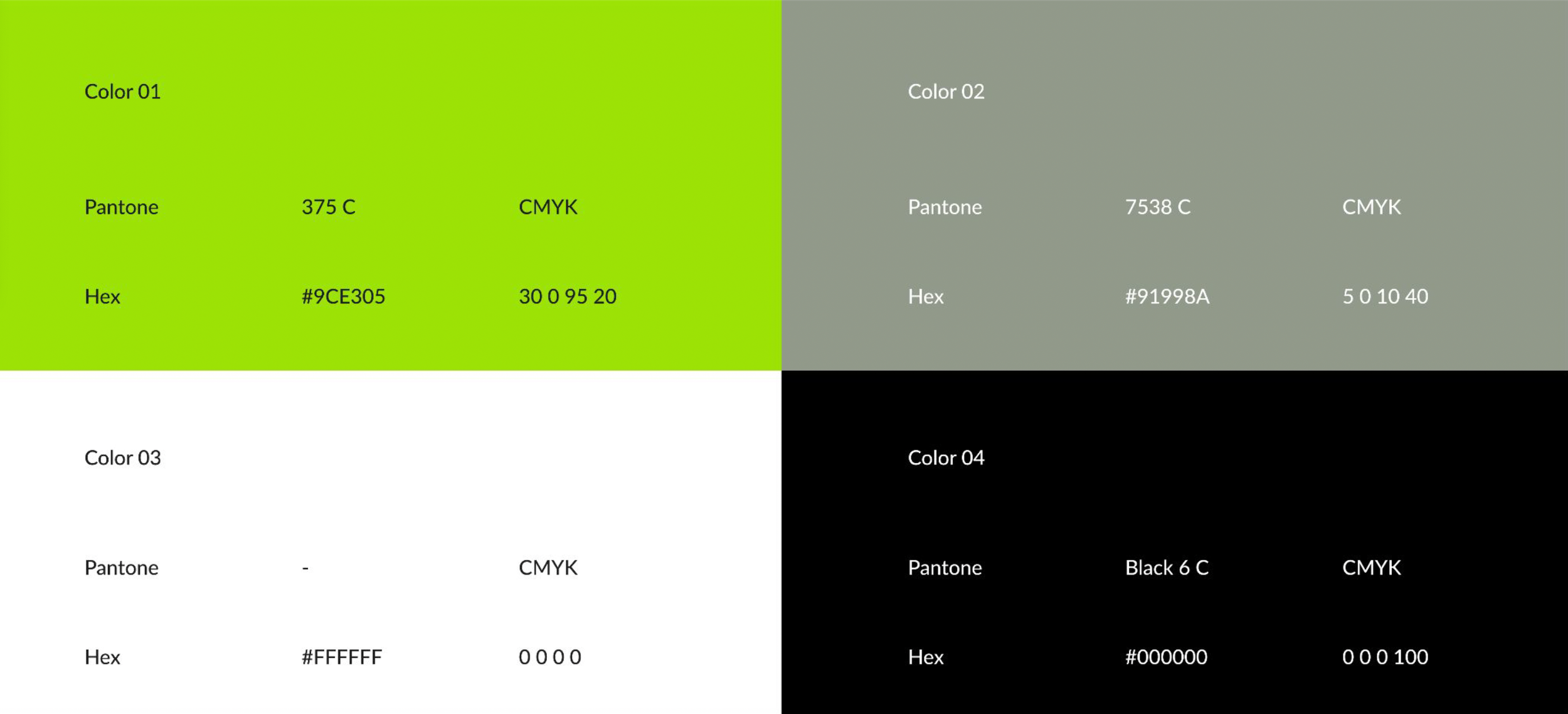
The mark is an interlocking LL monogram that reads as more: a speech bubble, an open door, an interlocking connection—the lime green cuts through a field of muted professionalism. Paired with navy and neutral grays, it stays sophisticated. Alumni Sans leads the headlines, and Lato carries the body copy, bold insights delivered through thoughtful dialogue.
Brand System
The identity system was built around clarity, emphasis, and human connection. It scales from social media to presentation decks, works in monochrome, and holds up whether the logo stands alone or is paired with type. The system was designed so Asif could use it independently without a designer in the loop every time. Clear rules for color, type, and tone that stay consistent regardless of format or surface.
Brand Touchpoint
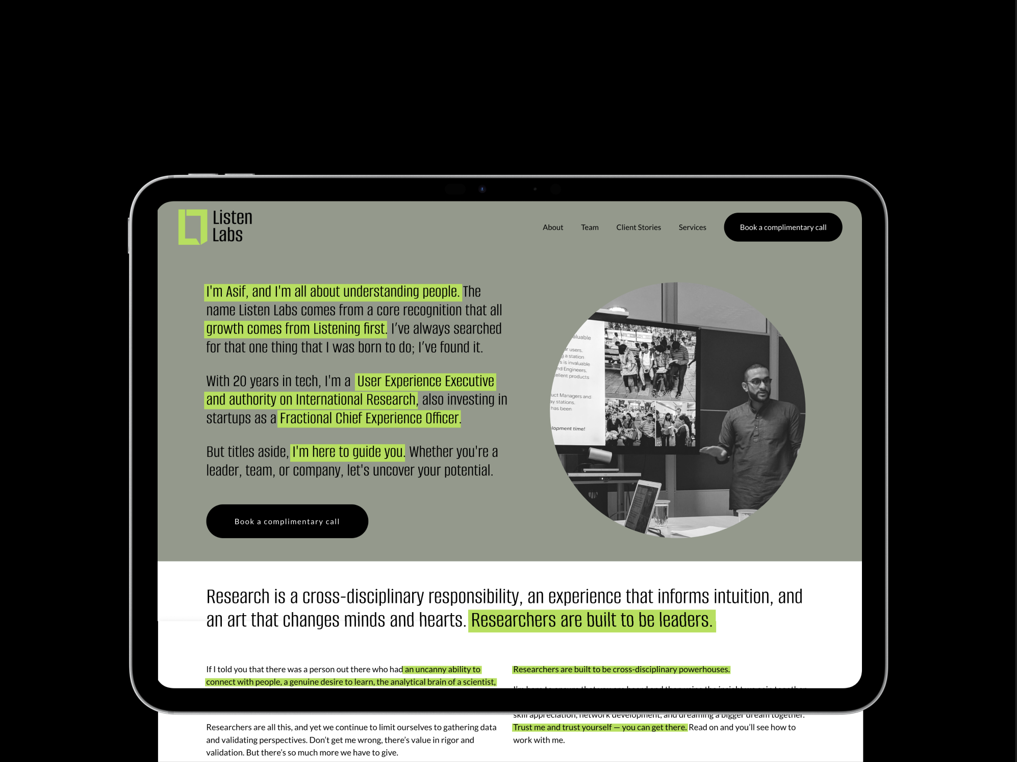
The site had one job: get someone who lands on it to book a call. I structured it around how trust actually builds. Who this is for first, then what it feels like to work with Asif, then proof from people who have. The writing sounds like him, not like a brand. The visual language carries the same restraint as the identity: clean layout, generous whitespace, and a tone that creates recognition through consistency rather than decoration.